
Finding the very best Call to Action (CTA) for your site can mean a huge lift in your current conversion rate.
Whether you’re trying to get someone to subscribe to your email list, submit a lead gen form or make a purchase, having a strong CTA is vitally important.
The bad news is that you could have an infinite number of brainstorming sessions, hire the very best marketer money can buy and still not come up with the very best CTA.
The good news is that you don’t need to waste time in brainstorming sessions or spend a lot of money on Don Draper. All you need to do is allow your website visitors to show you which CTA they respond to best.
How? Through a/b testing!
If you’re not already familiar with a/b testing learn all about it in this guide from Visual Website Optimizer.
I promised that you wouldn’t have to spend a lot of time brainstorming CTAs, and I will stand true to my word.
Instead of coming up with two different CTAs to test against each other on your own, I have pulled together some examples that you can copy for your a/b tests.
1. Email Subscription CTAs
Whether you blog for business or pleasure, you probably include a little signup box that allows readers to submit their email address to receive updates in their inbox.
What does your CTA button to kickstart this process look like?
Do you go with the standard “subscribe”?

Or maybe a lengthier “subscribe to the blog?”
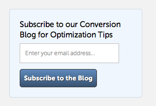
And what does the header above the form say? Do you just flat out say “subscribe to blog via email” or do you use a benefit-driven headline such as “Subscribe to our conversion blog for optimization tips”?
Using a benefit driven CTA can really boost the number of people who respond.
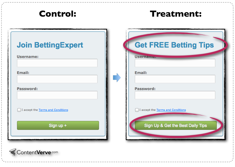
When BettingExpert a/b tested their signup form they were able to increase conversions by 31.54% through the use of a more benefit-driven CTA.
But before you jump to conclusions and start changing your forms based on BettingExpert’s results, know that there are plenty of other options that can also increase your email subscription rates.
For example, you can use social proof on or near your subscription form to increase conversions like ProBlogger and Convince and Convert do.

Social Proof is a marketing concept rooted in psychology that says people are more likely to do something if they see others doing it.
By showing that over 23,100 other readers are subscribed to their newsletter, ProBlogger entices other to sign up so they are not left out.
As you can see there is no single way to present an email subscription CTA. There’s also no way to know which option will work best for your website visitors without a/b testing.
2. Lead Generation CTAs
When it comes to the CTAs you use on your lead generation forms, you may be thinking that a simple “download” or “submit” button will work to convert visitors.
That may be true, but really the only way to know is to test it.
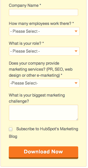
For example, might the “Download Now” convert more visitors than “Download Guide”?

And what about that traditional grey submit button… is it converting the max amount of visitors possible?
My guess is it’s probably not working as well as a more stylized button with a strong CTA,, but I could be wrong. That’s the beauty of a/b testing – it allows you to see in real time what actually works.
If you’re wondering why most companies shy away from the traditional small grey/white button it’s because a lot of research shows that buttons that stand out get clicked more than ones that don’t.
In fact, you may have heard before that BOB (the Big Orange Button) is the very best button you can use.
That’s not necessarily true, although it can be true in a lot of cases because a big orange button usually stands out from the rest of a website.
You can see in the examples above – that are from HubSpot and Marketo – both employ the use of BOB.


BOB seems like it would work really well because it really stands out against the background of the landing pages it’s on. It draws the visitor’s eye and then encourages them to click and convert.
If your website theme is mostly orange then BOB probably wouldn’t be the best idea for you.
If you’re wondering what the best color would be … test it!
3. Ecommerce Checkout CTAs
If you want a lot of your ecommerce website visitors to complete a checkout with you, the entire process has to be optimized — including the CTA that actually gets the visitor to start the checkout process.
There are a few tactics that successful brands employ in their a/b tests to increase conversions.
For example, since research shows that online shoppers like free shipping, one way to lift conversions is by placing information about free shipping near your CTA.

Another common concern for shoppers is that they won’t be able to return or exchange an item when it’s purchased online. You can easily eliminate that fear by reassuring shoppers that you have a hassle free return policy.
Of course every company can say they have a hassle free return process. If you want to provide great customer service and enjoy repeat business, then you need to follow through on this promise.
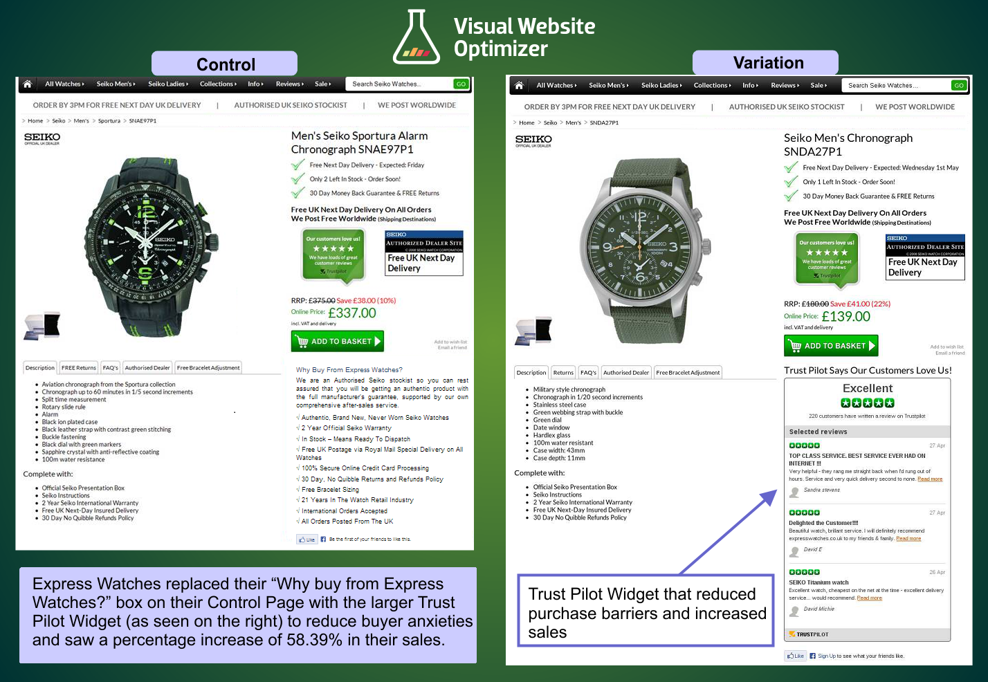
In addition to free shipping and hassle-free returns, showing positive customer reviews near the CTA can really help you increase conversions.
For example, when Express Watches added a customer review widget to their website they increased sales by 58.29%.
As for the actual CTA: Add to Bag, Add to Cart, Buy Now… the only way to know which option will work best for you is to test it!
RIPT Apparel was able to increase their conversion rate by over 6% when they began a/b testing their shopping cart CTA button.
What would a 6% increase in conversions look like for your bottom line? Pretty nice, I’m guessing.
What About Other Types of CTAs?
Do you need to optimize the CTA on your site for a situation not listed in this post?
No problem!
My advice? Start a/b testing your CTA until you find the version that gets you the biggest lift in conversions. If you would like us to review your landing page and provide some CTA a/b testing ideas just leave a comment with the link below.
]]>TJ has worked in the digital marketing space since 2006. He has worked at a number of agencies and and helped hundreds of clients grow their business through SEO, PPC, Social Media and Content Marketing. He currently lives in Lehi , UT and enjoys spending time with his family.
TJ Welsh
TJ has worked in the digital marketing space since 2006. He has worked at a number of agencies and and helped hundreds of clients grow their business through SEO, PPC, Social Media and Content Marketing. He currently lives in Lehi , UT and enjoys spending time with his family.